Nail bloggers are so generous!! Check out these awesome giveaways!
Nail Addicts Anonymous Giveaway
The Nail Venturess 50 Follower Giveaway
Varnish Vixen's "Yay! Spring!" Giveaway
Oooh Shinies' Giveaway!
Wednesday, March 23, 2011
Saturday, March 19, 2011
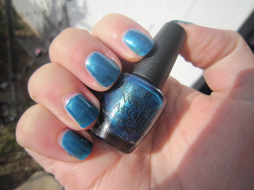
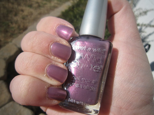
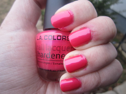
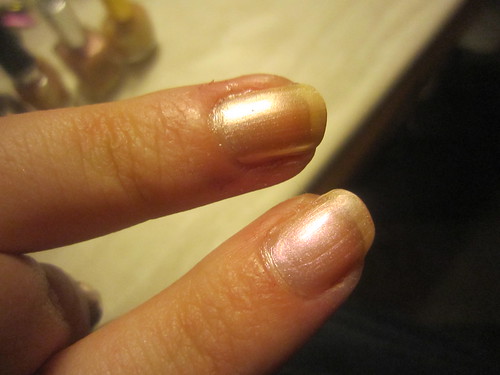
Claire's- Rain Drop
Raindrops keep fallin' on my head
And just like the guy whose feet are too big for his bed
Nothin' seems to fit
Those raindrops are fallin' on my head, they keep fallin'
---BJ Thomas "Raindrops"
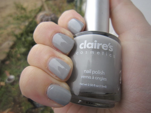
Love this! I had been eying American Apparel "Mouse" for a while when I bought this, thinking it might be similarish. It's not, not at all, and I actually like it much better. This is a cool, slightly-blue-toned grey that I think would be flattering for most people. It applied well and dried at a decent rate. Only prob is it was easily imprintable, even days after, so definitely use a good topcoat. Shown above is maybe 2-3 days of wear, so you can see how every little ding or bump left a mark. As a mom of 4 year old twins, my fingers might see some heavy use, so this was unfortunate. I actually have since bought Zoya "Dove" which I much prefer and these are similar colors, if not dupes, and has superior quality, and honestly, not much difference in price. I think Claire's polish is expensive, even though they seem to always have a BOGO 1/2 off deal. I think it was 4.99 and that is just too expensive, when I can get China Glaze or Orly or Finger Paints, basically anything from Sally's, at a cheaper price for much better quality.
Report card:
Color= A (love the color, it's just fun!)
Formula= C+ (mostly good except for those naggy imprints days after, so remember, topcoat is a must for this one)
Brush= B (decidedly average)
Price= C- (just not priced right at all)
Overall= B-
Monday, March 7, 2011
Piggy Polish- Daylilly's and Music
I got rhythm,
I got music,
I got my man --
Who could ask for anything more?
---"I Got Rhythm" George and Ira Gershwin
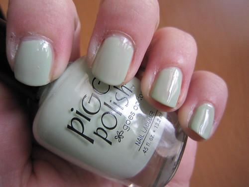
So pretty in the bottle, a dusty minty herby looking pastel green. Unfortunately, shown is 4 coats, and as you can see, it bubbled and was just not drying correctly at that point. Not to mention, it was NOT big3 free and has a bizarre odor, triggered a migraine for me. I guess I'll stick with Revlon "Minted" but if I had my druthers, I'd prefer a more yellow-based green like this one per the bottle versus Minted's bluish-tinge which looks kinda cotton-candyesque.
And these were supposed to come with a little toe-ring but mine did not. It WAS on clearance for 1.99 at Ulta, guess I can't complain too badly. I do wish I had known it wasn't Big3 Free, but oh well.
Report card:
Color= D- (the bottle is so misleading, it just was not opaque enough at all and looked sorta vomitish until I put enough coats for opacity)
Formula= D- (runny, difficult to apply, and fumey)
Brush= C- (stiff and pokey, not good with the thin formula)
Price= D (I paid just under $2, but it's $7 usually according to a quick google, which I find sorta blah considering my experience with it- not a good investment personally)
Overall= D
PS and DON'T get me started on the name. It grammatically makes no sense. Not only is "daylilies" misspelled but there's also odd punctuation, making it possessive, but without a reference to what. It's like saying "Joe's and Crab Shack!" or "Gilligan's and Island". Just... not right.
Wednesday, March 2, 2011
Maybelline- Iced Mauve
"Sir, we're on beige alert."
---aide to the Neutral Planet's President, on Futurama

This ain't mauve. It might be iced, but it AIN'T mauve. It's beige. I don't know why I bought this. I must have had a total brain fart. Oh, wait, I know why I got it, I wanted something similarly-toned to layer Wet n Wild "Blitzen" over. Blitzen can hold its own over just about anything, so it's less imperative to have this for undies now.
This is thick, chalky, and difficult to apply. It took too long to dry, despite the 50-second claim. Not only that, but it makes a weird dried-film on top, like you'd expect a fast-dry to be, but underneath took forever to set, so it gave me icky lines towards my distal edge.
So...
Report card:
Color= D- (maybe nice for mani hands, but kind of a weird, sallow beige, unflattering I think, the shimmer is ok though)
Formula= D- (very close to unusable, in my opinion)
Brush= C+ (fairly wonky, but not the worst by any means)
Price= B- (I paid 3.22 for mine I think, about average, but a waste considering my disappointment)
Overall= D+
PS, here it is over Blitzen.
Tuesday, February 22, 2011
Orly- La Playa
Hey Blue, there is a song for you
Ink on a pin
Underneath the skin
An empty space to fill in
--"Blue" by Joni Mitchell
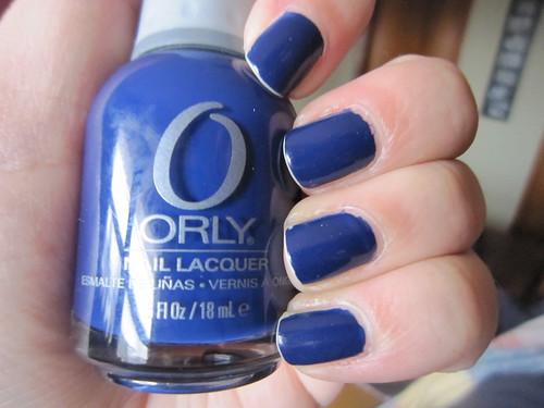
This was a color I was "lemming" and finally found on clearance at Ulta this past January. The color is just gorgeous! It is a bright, yet also dark and dramatic blue and so glossy. However, as pretty as the color is, the quality...meh, it leaves something to be desired. You wanna guess how old the above mani is?
You probably are thinking a couple days or so. NOPE! It was just 12 hours! Yeah...you see why I am disappointed. But the color...oooh, it's so pretty. Maybe if I can find the right topcoat (I used Orly's Top to Bottom I think it was called). Either way, I love the color quite a bit, and certainly think it's worth another shot. Especially since it was basically a one-coater!
Report card:
Color= A (pretty dang beautiful)
Formula= C+ (thick, difficult to paint somewhat, and did not hold up)
Brush= B (pretty good, but not quite sturdy enough to maneuver the polish adeptly)
Price= C- (4.99 usually at most beauty supplies, not too bad if it were good quality, but it was disappointing. I at least found mine on clearance for 2.99)
Overall= B-
Monday, February 21, 2011
Color Club- Catwalk Queen
I'm a model you know what I mean
And I do my little turn on the catwalk
Yeah on the catwalk on the catwalk yeah
I do my little turn on the catwalk
---Right Said Fred "I'm Too Sexy"
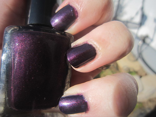
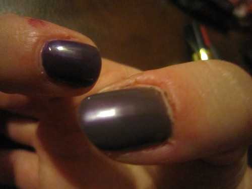
Ooh, how pretty! It's a shimmery, vampy, plummy browned-purple. It applied like a dream and was just so flattering on my skin-tone. I think it probably would be flattering for most, even though it's so dramatic. It's just pure sexiness. I found this in a 7 pack at Ross for 7.99 so if you find it, it is worth the money. The other colors were good too, so it's a nice investment.
Report card:
Color= B+ (pretty, although not unique)
Formula= A (very close to perfection, just a smidge unwieldy with the thin brush)
Brush= C+ (thin and a little flimsy, not good with the thick polish)
Price= A (ended up a dollar a polish, which is kick-butt)
Overall= B+
Thursday, February 17, 2011
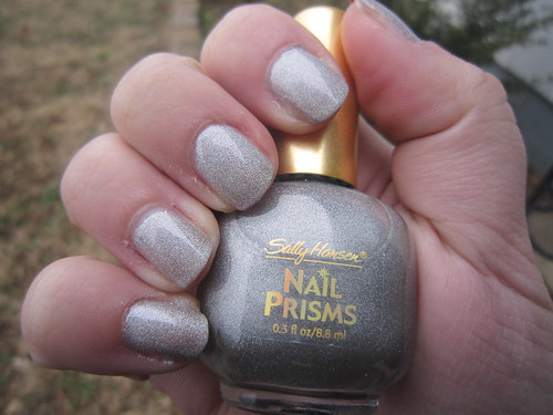
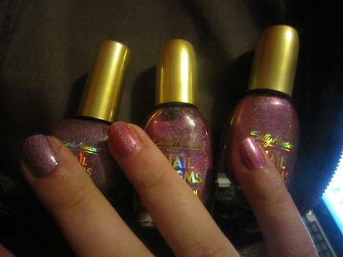
Sally Hansen- Pink Rose Diamond
Ray Evans
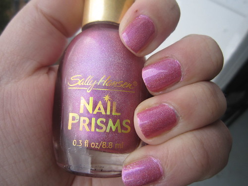
This is one of the Nail Prisms holos I got at Dollar Tree in the Sally Hansen 2-packs.
I will try and set aside my dislike of holos, but I am really generally not a fan. It just looks too techno or futuristic to me. I'm just kinda meh.
Setting that aside, I do like the base color, a funky, juicy, fruity pink, and the holo glitters are more subtle than the other Nail Prisms I got. It unfortunately was more sheer than the others, and very very similar to the Blush Diamond. You can see the difference between those two, and the Purple Diamond here.
Report card:
Color= C+ (not my style, and kinda cheap looking)
Formula= D+ (kinda took a while to dry, and had a dull finish, so a topcoat is a must)
Brush= D- (thick, bristly, and splayed...very poor)
Price= A+ (excellent, considering it was just 50 cents basically!)
Overall= C
Tuesday, February 15, 2011
Barielle- Snow Day
Hal Branston: Come on Lane! This snow day happened for a reason. It's given me a second chance with Claire.
Lane Leonard: Hal, what do you think she's gonna do? Hold you to your chest and lick your ear and call you funky?
---Snow Day (2000)
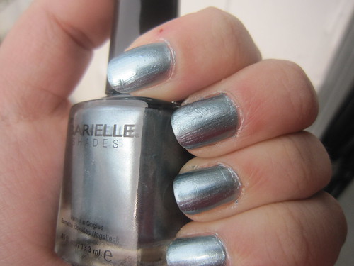
Ok, so the weather outside is nice today. I thought I'd be contrary and post this polish today. In the bottle, I was pretty wowed. It looks like a pretty metallic grey-blue shade. It unfortunately was not my cup o' tea.
During application, it was thick and globby and hard to maneuver. Remember, I've been out of the polish game for a while, plus, I have a health problem that sometimes gives me shaky hands, so polishes too thick or thin can be a bad idea for me. This was definitely too thick. Not only that, look at all the brush-strokes. It was not attractive. I later tried a topcoat which did not help at all. I think if you try it, you will need one thick coat of topcoat or at least 2-3 regular ones, just to overcome the chalky texture.
It did last a while though. 3-4 days with no damage. It may have went longer but I was way bored with it.
Report card:
Color= C- (kinda generic, and even if pretty in the bottle, it doesn't stay that way on the nail)
Formula= D (I found it extremely difficult to apply and hated how bad it was for brushstrokes)
Brush= C- (again, just too long for this polish)
Price= D+ ($6 at Ulta usually, though mine was 1.99 on clearance)
Overall= D+
Rest in Peace- OPI "A Good Man-darin is Hard to Find"
Victim of children, jumping on the couch, unaware of my upturned mani basket. Oh the humanity! The couch got collateral damage as well.
Monday, February 14, 2011
Thursday, February 10, 2011
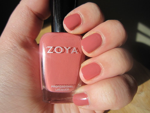
Essie- Demure Vixen
Among the taller wood with ivy hung,
The old fox plays and dances round her young.
---"The Vixen" by John Clare
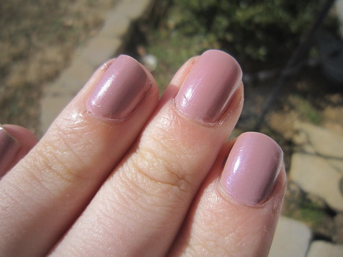
Shown is about three days of wear, so w00t! I had a big lust for this color after seeing it on another blog, and I found it by happenstance on clearance at Ulta last month. I wasn't quite like I thought, it was much sheerer, but I have now come to understand why everyone says that about Essie. It's true! They are so sheer usually! This is about 4 coats I think, maybe even 5 on my thumb and middle finger.
I don't care though, it was gorgeous, and lasted forever, so when my mini one runs out, I will be buying another. It's just such a lovely, unique color and I can see it working for multiple occasions/scenarios.
Report card:
Color= A (love it, so perdy, but would get top marks if it was more saturated)
Formula= A (ditto, only prob is it's too sheer)
Brush= B (well, it's a mini, but even so, it's not a bad brush)
Price= D- (they seem to be 7ish bucks regular price, and that's expensive if you end up not liking it)
Overall= B-
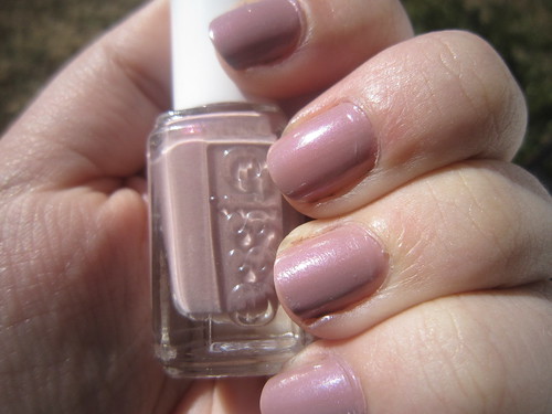
Wednesday, February 9, 2011
Zoya- Penelope
In the pathway of the sun,
In the footsteps of the breeze,
Where the world and sky are one,
He shall ride the silver seas,
He shall cut the glittering wave.
I shall sit at home, and rock;
Rise, to heed a neighbor's knock;
Brew my tea, and snip my thread;
Bleach the linen for my bed.
They will call him brave.
-"Penelope" by Dorothy Parker
LOVE this! It's a creamy brownish pink. It is officially one of my favorite colors. It's so neutral, yet different from the average red, pink, or beige. It's just chic, minimalist, classiness.
It applied easily, dried at a decent pace, and lasted for a while. I think I wore it 5 days or so and it had nary a scuff and I only changed it because I get bored easily.
So, if you need a nice, yet different business-appropriate color, this is a winner!
Report card:
Color= A+ (it's neutral yet I swear it pops on your nails!)
Formula= A (it was just a little thick, but still so wonderful)
Brush= A (a little thin for the thickness of the polish, still excellent though)
Price= D- (it's $7 a bottle, which is expensive, but for me, this was a great investment!)
Overall= B
Tuesday, February 8, 2011
A note as from a single place,
A slender tinkling fall that made
Now drops that floated on the pool
Like pearls, and now a silver blade.
---Robert Frost "Going For Water"
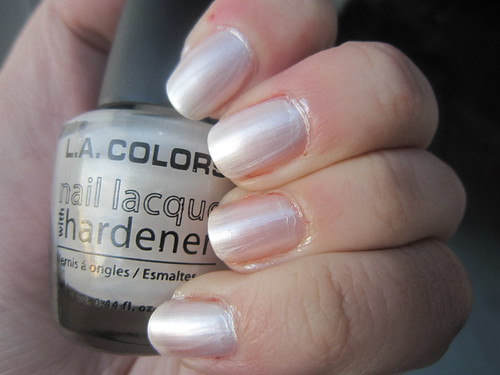
This was just a dollar at Dollar General. I had high-hopes, since I have had decent luck with L.A. Colors. Unfortunately, this one sort of bombed. Shown is 5 coats and as you can see, there is still VNL. It was pretty aggravating. Also, it just wasn't as lustrous and I wanted it to be, it just looks milky. And it's too brush-strokey for layering, so this lacquer is just sort of useless to me. I have since frankened with mine and it doesn't even seem useful for that either.
Report card:
Color= C- (bleh- too frosty, too milky)
Formula= D- (wayyyyy too thin and sheer)
Brush= B (actually ok here)
Price= A+ (just a dollar, so if it sucks, you haven't wasted much)
Overall= C+
Saturday, February 5, 2011
Cover Girl- Copper Penny
God if you're listening would you come up with some change?
Cause I wake up every morning with a penny to my name.
---"Penny" by Idina Menzel
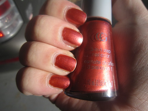
This swatch is from about 36 hours of wear. Obviously, not too good. Chipped, grubby looking, scuffed, etc, just not a good look.
I love the color though. It's a rich, coppery autumn-brown-red. It was very flattering on me, colorwise, and even if a little brush-stokey, the metallic finish was nice with the color. It is just very thick.
I had a coupon though and only paid 65 cents for it, yeehaw!
Report card:
Color= B+ (I like it, it's also a generally flattering color)
Formula= C (thickish and brush-strokey)
Brush= C+ (for the thickness of the polish, the brush was definitely lacking)
Price= B (was just 2.65 and I had a $2 off coupon)
Overall= B-
Tuesday, February 1, 2011
OPI- Yodel Me on My Cell + exciting news!
I went across to Switzerland
Where all the Yodellers be
To try to learn to yodel
With my yodel-oh-ee-dee
I climbed a big high mountain
On a clear and sunny day
And met a yodellin' gal
Up in a little Swiss chalet
---Frank Ifield "She Taught Me How to Yodel"
Lovely color! It's a pretty teal with a metallic shimmer. It wasn't as opaque as I would have liked, but applied well, especially considering it was a mini, which tends to give me probs. Whenever I run out, I do believe I'd like a full-size bottle. It would make for an awesome summer pedicure.
It's rainy and dreary outside today, so this swatch from a few weeks ago is just the thing to brighten my mood.
Report card:
Color= B+ (it's kinda generic in theory, but it's done right)
Formula= B+ (hits all the marks except it is more sheer than it ought to be)
Brush= A (basing it on a full-size bottle, since minis suck)
Price= D- ($8 is either good or bad, if you love or hate the polish, so it's a gamble)
Overall= B-
+++++++++++++++++++++++++++++++++++++++=
And the exciting news is I won a giveaway! My very first actually! It was hosted by Rachel Marie's Nails. I can't wait for it to arrive in my mail box!
Sunday, January 30, 2011
OPI- Ali's Big Break
I'm a girl
I'm gonna live the dream
I'm gonna live out my fantasy
Look at me
And tell me what you see
You know what I'm gonna be
---Bo and Monica "I'm Gonna Be a Star"
Not much to say here- didn't like this. It was super thick, gummy, and difficult to apply. I just wasn't a fan. I love the bright, cheery, cherry-red of the bad, but the flecks where just too thick I think? Maybe my novice-ness is just too pervasive, but I just did not apply this well. I had high hopes when I looked at it in the bottle, but once I got down to applying, that hope flew out the window. It was realllllly sheer too.
Oh well...
Report card:
Color= C+ (great in theory, but not so much reality)
Formula= C- (bad, especially a letdown since I love OPI)
Brush= A (OPI generally has good brushes, but this was a mini and sucked majorly)
Price= D- ($8, a toss-up- good if you like it, but a bigtime bummer if you don't)
Overall= C
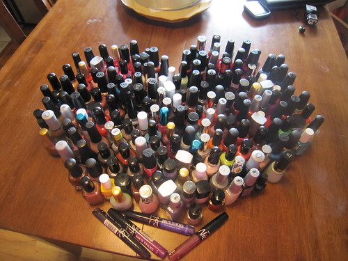
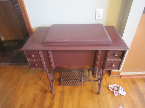
Not a helmer but...
This is the home of my polishes. It's an old treadle machine! Ignore the rag and ziplock baggie full of cleaners, I was cleaning it)
Saturday, January 29, 2011
OPI- Take the Stage
He was a "rock and roll messiah"
She was known for her childcare
The truth is gonna give up the world
If you can give up the stage
If I can give up the stage
If we can give up the stage
---Live "Stage"
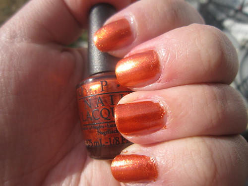
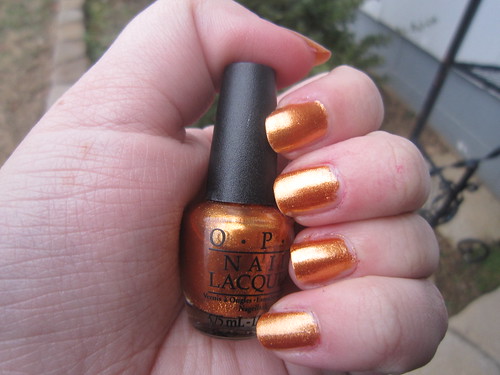
Like the others in the collection, it isn't so bad. But it's a glitter, which is not really my kind of thing. It's nice enough though, if you are into glitters. It's very foil-ish in finish and lasts well. It isn't so gritty either as other glitters can be, it's pretty fluid and smooth. It's a pretty, juicy orange too, it's nice. Unfortunately, it's not very versatile in my opinion. Also, it might make some people's skin look off, green or brassy.
Color= B (it's nice, if you like orange and glitter)
Formula= A (really nice, as OPI usually is)
Brush= A (this is a mini, but OPI's are usually great, though minis usually stink, especially with glitters)
Price= D- ($7.50, either a good investment, if you like it, or a total wash, if you hate it)
Overall= B-
Friday, January 28, 2011
Wet n Wild- Wild Card
I love you 'cause your Deuces Are Wild, girl
Like a double shot of lovin' so fine
I been lovin' you since you was a child, girl
'Cause you and me is two of a kind
---Aerosmith "Deuces are Wild"
Love this one! I came across it online in pics when I was trying to discover the name of a nameless Wet n Wild I got in a holiday gift set. My nameless is more pink. Wild Card is more purple. It is a slightly golden-tinged duochrome as well.
Formula is excellent, applies and dries awesomely. It is a pretty color to me as well, and I think flattering for many. I can see it working for lots of different occasions, dressed up or dressed down. For 99 cents, you can't go wrong!
Report card:
Color= A (I think it's unique, and pretty as well as generally flattering for many skin tones)
Formula= A- (I had like one bubble, but the rest of it was awesome)
Brush= B- (it was a little long, I'd rather it were a smidge shorter)
Price= A+ (just 99 cents!)
Overall= A-
Thursday, January 27, 2011
Franken- "Aurora"
Aurora is the effort
Of the Celestial Face
Unconsciousness of Perfectness
To simulate, to Us.
---Emily Dickinson "Aurora is the effort"
I frankened this with L.A. Colors "Classic White" and L.A. Colors "Classic Pink" plus some Jazz "18K Gold" and some Sally Hansen "White Diamond." I like it, it has a very odd, but pretty, finish in my opinion. It looks fluid and milky, yet also metallic. It looks like the gold rays of dawn breaking, hence why I named it "Aurora." It was opaque in 3 coats and didn't have many issues formulawise. I like it, and decided it's a keeper. Oh, I dug around and it looks very similar to Chanel "Gold Lame." Fun!
Report card:
Color= A (I realllllllly like it)
Formula= A- (it's pretty good I think, maybe a smidge gummy)
Brush= n/a (this is a L.A. Colors bottle, came in a mini mani 2 pack)
Price= B+ (I figured this up to have cost me about $2.25, so not bad)
Overall= A-
Wednesday, January 26, 2011
OPI- Rising Star
The ugly mess you thought you were is fading fast
Now something's spoken through it's virtues
The night of black is rolling back at long last
The wheel of fate turns to your fortune
---Wishbone Ash "New Rising Star"
I knew I wouldn't like this, so I was meh with the swatching, sorry. I just don't like glitters that much. I like the red one, but the rest, bleh. Not a fan personally. They are very pretty and blingy though, just not my style.
Color is a super-shiny, bright foily glitter with a golden base. Application was decent, considering it was a mini and the brush sucked. Dried quickly as well.
Report card:
Color= B+ (it's interesting, I'll give it that, and pretty, if you are into glitters)
Formula= A (this was rather nice, considering)
Brush= A (well, rating for a regular OPI brush, not this one, which was a mini and sucked totally)
Price= D- (OPI are 7.50 to 8 bucks, which to me is too expensive for a polish I am not in love with)
Overall= B
Tuesday, January 25, 2011
Sally Hansen- Diamond
"I loved being outside. We'd hold lightning bugs in our fingers and pretend they were diamond rings."
Loretta Lynn
I bought this at Dollar Tree in a 2-pack. I found several Nail Prisms there. This one is "Diamond" and it's a silvery-grey base with lot of holo glitter. It applies....ok. It's pretty bleh to me. Not really here or there ya know. Kinda was gummy and slow to dry, but it does look interesting and pretty when it's all said and done. I just don't foresee an occasion where I'll wear this again unfortunately. Just not my style.
Report card:
Color= B+ (it's interesting, but I don't think flattering for many skin tones)
Formula= C (kinda is lowish marks all across the board, not the worst, but not good either)
Brush= D (pretty splayed and unruly)
Price= A+ (2 pack for a dollar, so 50 cents, woot!)
Overall= B-
Monday, January 24, 2011
L.A. Colors- Tease
---Dorothy Fields
Ew...this was just....ew. Shown is 4-5 coats. It took forever for opacity. By those last coats, I got lazy and disgruntled, hence the horrible paintjob. I knew I was removing it later and never wearing it again.
That's all I got to say about that!
Report card:
Color= D- (except for some slightly interesting blue flash, most unoriginal fuchsia ever)
Formula= F (5 coats! Need I say it again?)
Brush= D- (super thin and flimsy, barely usable with this polish)
Price= A+ (hey, it was a buck- a buck wasted though imo, but I'll give it an A here, generally I am happy with L.A. Colors)
Overall= D+
Sunday, January 23, 2011
Color Club- Best-Dressed List
---Charles Dickens
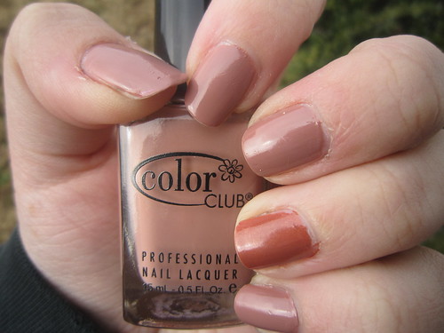
This might look a little beat-up. I had worn it for 4 days after the holidays, so I was packing up lots of stuff like the Christmas tree, decorations, wrapping stuff, etc. I loved it, and I think it looked great and lasted well. It's a taupey mushroomy earthy tan. Very pretty and flattering to my skin tone. Not sure if it would be flattering for everyone though.
On my ring finger is a comparison of L.A. Colors "Antique Rose." Obviously, it's much redder and much darker, and has the golden shimmer where BDL does not. I like both.
Report card:
Color= A- (pretty lovely, if a bit neutral)
Formula= A (just about the best around)
Brush= B (mine is just average)
Price= B- (I got mine in a multi-pack at Ross for 8 dollars, but they run 3-4 dollars singly online)
Overall= B+
Saturday, January 22, 2011
L.A. Colors- Antique Rose
A single rose can be my garden... a single friend, my world.
---Leo Buscaglia
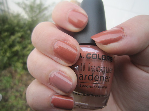
This is L.A. Colors "Antique Rose" with Color Club "Best-Dressed List" on the ring finger as a comparison. It is a dark clayish color with an interesting golden shimmer. I actually really like it, maybe the most of all my clay-toned polishes. It has a lovely depth hanks to the shimmer. It dried quickly and lasted well, and held up just as well, if not better, than the Color Club did. It hard barely any tipwear at all after 3 days, and the CC had slightly more. And get this- it could easily be a 1 coater if you apply it well!
All that for a dollar! I won't complain!
Report card:
Color= A (very nice, to me. It's one I plan to rewear often)
Formula= A (pretty nifty, it might be slightly thick, but overall, still great)
Brush= C+ (the brush is too thin to me, it would be better if it was a bit sturdier and wider)
Price= A+ (just a dollar, so that's the best you can ask for)
Overall= A-
Thursday, January 20, 2011
Essie- Nude Beach
"Now that nude-beach season is in full, um, swing, taking things off is once again a public matter. It comes with the additional difficulty of hot sand under one's feet and the unavoidable, inescapable truth that gravity always wins."
---Elizabeth Rosner
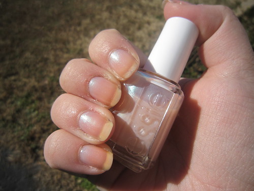
Yeah, my nails are stained. It's a shame because this is lovely on its own in my opinion. This is similar to a polish I used to have, Sahlly Hansen used to make it. It was from the Star Opal line but I can't remember the name. Oscar broke my bottle and I forgot to find the name. So, I scoured the internet and bought what most looked like it, which was Pure White Opal. But it's not pure white at all, it's a beigey milky color. Maybe it's old and has yellowed. Eithey way, it looks gross. But this polish looks virtually identical to my original polish, so I think I am not going to worry about it any more.
I love it for "lazi manis" where I just swipe on a single coat for some subtle shimmer and then go on about my day.
Report card:
Color= B- (not the most original, but I like it, and it's nice for layering)
Formula= A- (it's good, dries nice and stuff, not too gritty, etc etc)
Brush= B (average)
Price= D (seems like it runs 5 to 8 bucks, depending on where you find it)
Overall= C+
Wednesday, January 19, 2011
Color Club- High Society
"Mike: [on telephone] This is the voice of doom.
Mrs. Lord: What?
Mike: This is to tell you your days are numbered.
[hangs up]
Mrs. Lord: Oh dear. One of the servants has been at the sherry again. "
---High Society, film (1956)
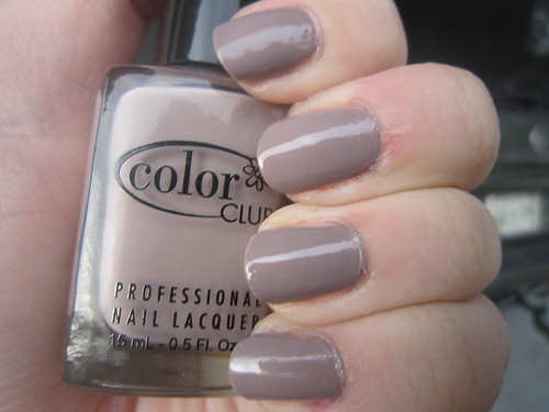
Ignore the fuzz! lol
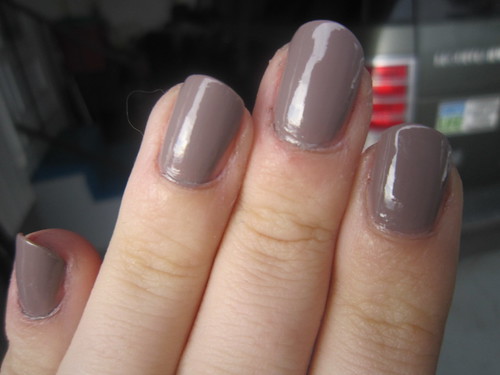
In a word- LOVELY! I love this color and i was very flattering on me. And Color Club's quality was amazing, especially considering I found a set of 6 or 7 polishes at Ross's for just 8 bucks!!! I was shocked! This is definitely excellent quality polish here, so that was a great price!
It's a creme clayish taupeish greyish dreary-dayish cafe-au-laitish kinda color and I love it. Definitely classy! It also lasted forever and with a nice shiny finish and dried in a reasonable amount of time. It's a keeper!
Report card:
Color= A- (I've seen it with other brands, but it's done right)
Formula= A+ (excellent!)
Brush= B+ (a smidge thin but still fine)
Price= B- (not considering the awesome price at Ross, which ended up about a buck a bottle, it can be found for between 3 and 4 dollars online at various locations)
Overall= B+
Tuesday, January 18, 2011
Revlon- Perplex
EXPERIENCE, like a pale musician, holds
A dulcimer of patience in his hand,
Whence harmonies, we cannot understand,
Of God; will in his worlds, the strain unfolds
In sad-perplexed minors: deathly colds
Fall on us while we hear, and countermand
Our sanguine heart back from the fancyland
With nightingales in visionary wolds.
We murmur ' Where is any certain tune
Or measured music in such notes as these ? '
But angels, leaning from the golden seat,
Are not so minded their fine ear hath won
The issue of completed cadences,
And, smiling down the stars, they whisper--
SWEET.
---"Perplexed Music" by Elizabeth Barrett Browning
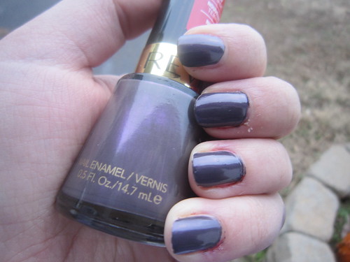
I have a terrible camera, in terms of fine, up-close detail like the shimmer in this polish. We also had a spate of terrible weather when I swatched this. But, I can attest that is looks just like all the other online swatches and is just gorgeous! This color has "me" written all over it. I love purples and blurples, and greyish colors, and shimmer. It's also excellent in terms of formula. It was opaque in just one coat for most fingers, though I added a second coat for good-measure, dried fairly quickly, and was hardy and lasted a while. I also think it would be flattering for many skin tones. Just an all-around nice polish.
Report card:
Color= A+ (Love it, even though I know it's a dupe. I am definitely not paying Chanel prices!)
Formula= A+ (also love it, hits all the marks)
Brush= A (mine is ever-so-slightly too narrow, but it is still awesome)
Price= C (I paid $4.49 at Ulta, well worth it!)
Overall= A-
Monday, January 17, 2011
Comparison- Revlon "Perplex" versus NOPI "Bah Plum-Bug"
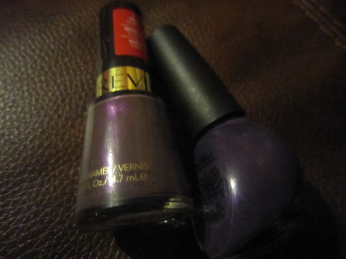
This is Revlon "Perplex" and Nicole by OPI "Bah Plum-Bug." I had spotted the NOPI at Marshall's and this was before I'd found Perplex at Ulta. So I thought it might work towards my Jones for Perplex/Paradoxal. Obviously, it is more "blurple" than dusky violet like Perplex/Paradoxal. It also has more of a rosy shimmer versus the violet glow that Perplex has.
One shoddy swatch later (ignore icky cuticles and how I didn't bother cleaning it up, I was lazy that night lol)- Perplex on thumb and Bah Plum Bug on pointer.
The differences are even more obvious on the nail than in the bottle. They really aren't alike at all, but, the idea is similar I suppose. Perplex is opaque in 1 coat, I swear. And I believe it's a creme. BPB is a jelly I think, and it took 2 coats, 3 on my thumb and middle finger I think.
I hesitate to pick a winner of these. Obviously, Perplex is gorgeous. But BPB isn't to be ignored either. I am glad to have both, but to be honest, the BPB's quality does leave something to be desired. It definitely needs a good topcoat (or two) because it is not a hardy polish. Easily scuffed for sure!
Sunday, January 16, 2011
Comparison- Vampy Reds
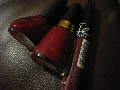
Left to right: Nicole by OPI "Deeply in Love," Revlon "Raven Red," and Nic's Sticks "Do You Deliver."
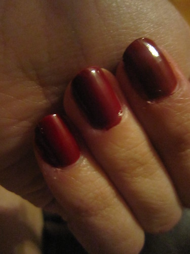
Middle= Nic's Stick
Ring= Revlon
Pinky= NOPI
As you can see, the colors are all similar, yet different.
The Nic's Stick is the darkest. It almost has a purple-based tone to it. Shown is three coats for that one, since it is difficult to apply with that applicator. I love the color though, a great berry-wine red. It might have been easier to apply but my cheeky-monkey aka my son Oscar messed with it a while back and left the cap off, so it dried out. I've messed with it and nursed it back to usability, but it's frustrating, and as you can see, I have at least 2 other colors that fill the vampy-red desire and are much more easily applied.
The Revlon is a creme. Supposedly it got it's name based on the blood of a raven? Eh. It just sounds like an attempt to be gothier-than-thou to me. But, my middle name is Raven, so I had to purchase it (this was before I knew Zoya made a polish named Raven). The color is nice, and it applies decently. This is just a very average polish, in all terms. Average color, average application, average availability and price. It's just not something spectacular. But I would consider it classic. It is more bricky and opaque than the others. It does need a topcoat in my opinion, it can be prone to scuffs and tipwear more than average. Shown is 2 coats.
The Nicole by OPI polish- oh me. I love it. It's not a creme I don't think. I believe it's a jelly, or perhaps a mixture. Shown is 3 coats, but I think you can do 2 thickish coats instead. It's lovely and applies to nicely. It's a blood-red, and so dramatic. It has a slight blue tone to it and just exudes class and sexuality all in one and definitely VAMPY. It dries fairly quickly and with a cushy, glossy jelly-like finish. If you want a classic or vampy red, this is a great investment. Definitely the winner of the group.
Saturday, January 15, 2011
Comparison- Medium Purples
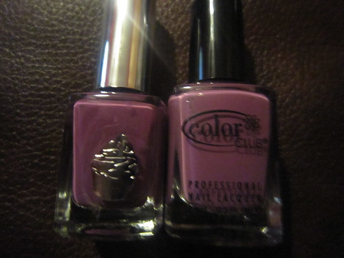
left to right: Simple Pleasures nameless polish (from a JCP gift-set) and Color Club "Uptown Girl."

hasty swatch, thumb= nameless polish & pointer= Color Club.
As you can see, the colors are near identical. And for as cheap as it was, the nameless polish was not too bad in the quality department. But, the Color Club...wow. It's a dream to apply. It's glossy and cushy and just oh-so-nice.
But, you can catch the JCP set on clearance for 3.60 a box, which contains about 7 polishes I believe. About a week ago, my JCP still had lots of the polish. Check it out, if you are craving this color for cheap.
Friday, January 14, 2011
Comparison- Light Pinks
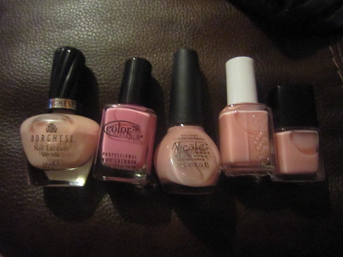
Left to right: Borghese "Angelica Blush," Color Club "She's Sooo Glam," Nicole by OPI "Scene Stealer," Essie "Pinking Up the Pieces", and L.A. Colors "Classic Pink."
Burry swatch, apologies...
Thumb= Borghese, pointer= CC, middle= NOPI, ring= Essie, and pinky= L.A. Colors.
Obviously, the Color Club one is definiely not similar at all. I wasn't sure til I applied it how sheer it was going to be. It's not sheer at all, it's pretty dang opaque. And BRIGHT. And fun. I am using that this spring for sure.
The others were more my intention, which is to say, French mani pinks.
Borghese's "Angelica Blush" was kinda streaky and thick. I am thinking of adding some Zoya Renew to this one to thin it a bit. It's unwieldy to apply and as you can see (pictured is 3 coats), just too dang streaky. It's lovely though and is the perfect color for a French mani.
Nicole by OPI "Scene Stealer" is a pretty color. It's interesting. It's pale and a similar lavender-based pink, reminds me of a pink version of Essie "Demure Vixen," which I happen to be sporting at the moment. As pretty as the color is, I have to admit, the application is sadly lacking. It's just a bit thick, and streak enough, to make you not want to continue wearing it. Plus, it is dependent upon a thick topcoat. It has a slightly chalky finish and was fairly imprintable even 24+ hours later. But it is such a nice color, in my opinion. But not quite right for a French mani. It's too saturated a color.
Essie "Pinking Up the Pieces" is interesting. It reminds me of a smoother version of Savvy Femme Couture "French Opal Rose Frost" with less obvious bluish flash. I think it would make for an interesting French mani actually, different from the normal sheer pinks. The ever-so-slightly-noticeable blue flash is lovely. It is extremely sheer, so don't expect to apply 3 or even 4 coats and achieve opacity. Pictured is 4 coats. Nuff said. This is best enjoyed as an intentional sheer, and I think 2 coats is best for it.
The L.A. Colors "Classic Pink" came in a cheapie clearance 2 pack from the Dollar General this past fall. I was hopeful it was going to be decent for a French mani, but honestly, it was way too streaky. The little brush was not conducive to application either. I have since frankened with it. I made a very pretty color at least, I will show it later.
So, ultimately, I wasn't too impressed with any of these for a Classic French manicure. I have kept the Angelica Blush, it most suits that purpose. But I will either need to thin it out or learn better ways of applying it. Essie "Pinking Up the Pieces" is a great option if you are looking for an unusual mani. L.A. Colors "Classic Pink" is not worth purchasing. But you can franken with it just fine. :)
Enjoy!
Thursday, January 13, 2011
OPI- Lucerne-tainly Look Marvelous
"I am a marvelous housekeeper. Every time I leave a man I keep his house."
---Zsa Zsa Gabor

This was part of a mini set I got for Christmas from OPI called "Irri-swiss-ables." This was my favorite of the set. It is a shiny, dark silvery foil/glitter. I has a great finish, only slightly gritty. It says a lot when I like a glitter, since I normally can't stand them.
To me, this color is worth any hassle a glitter might deliver. I wore this for several days. Since it is a mini, I may end up buying the full-size, once I wear through this one. I'm not really sure.
Oh, and if you are wondering what's up with my ring finger, it's lighter because I put a coat of Wet n Wild Blitzen on there out of curiosity.
Report card:
Color= A (pretty nifty)
Formula= A (pretty nifty as well)
Brush= B+ (well, this is a mini, so it's not the best, but normally OPI brushes are awesome)
Price= F ($8.50, even that is a big expense on my budget!)
Overall= B-
Wednesday, January 12, 2011
Comparison- Classic Red Cremes
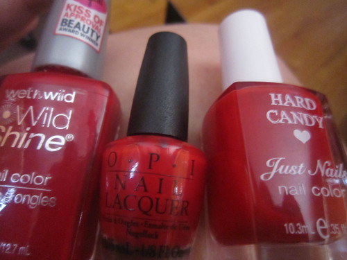
Left to right: Wet n Wild "Red Red," OPI "Color So Hot it Berns," and Hard Candy "Fishnet."
My quick-n-dirty swatch:
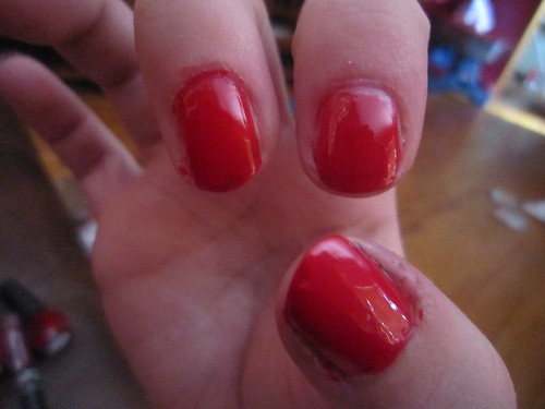
Thumb= WNW, pointer= OPI, and middle= HC
As you can see, they are all very similar in color. CSHIB is perhaps more orange-toned than the other too, and the WNW more blue-toned, while the HC is more in the middle.
As far as formula goes, I honestly prefer the WNW. The Hard Candy one was too thin while the OPI was too thick. The WNW applied like a dream. All dried very well and have nice glossy finishes.
Ultimately, because of the ease of application being the only difference really with these polishes, I gave 1st prize to WNW "Red Red" and the other two are tied for 2nd.
I don't think I need all three, they are all so similar. Some may prefer to have them all, they might be different enough to them. But this el cheapo wishes she only had one of them.
Tuesday, January 11, 2011
Comparison- Sally Hansen Nail Prisms' Holos
Left to right: Purple Diamond, Pink Rose Diamond, and Blush Diamond.
I found these at Dollar Tree in 2 packs for a buck each. That's a pretty good deal. However, I apparently do not like holos. I like the purple one, but that's minimally so. The rest I can do without. They are all too similar for me to need them all.
They kinda take a little bit to dry, but not too bad, and they have a nice finish. I just don't like holos, bottom line. I think it looks odd on my fingers. Maybe for a party or something?
Monday, January 10, 2011
Comparison- Teal Metallics
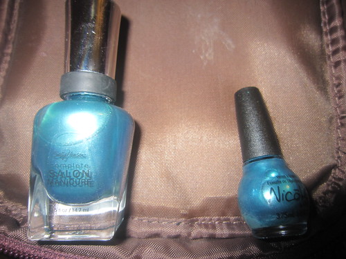
This is Sally Hansen "Lagoon" on the left and a mini Nicole by OPI "Jade in the Shade" that came in a Wal-Mart holiday gift set this past Christmas.
Here's my icky, blurry swatch, Lagoon on ring finger and JITS on pinky.
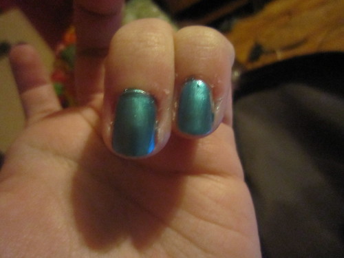
See, they look a LOT a like. JITS is not as opaque as the others. Since I have more of the Lagoon and it's more opaque and applies more easily, I used the other for frankening already. But I decided to swatch them so people can decide if they really need both.
Enjoy!
Sunday, January 9, 2011
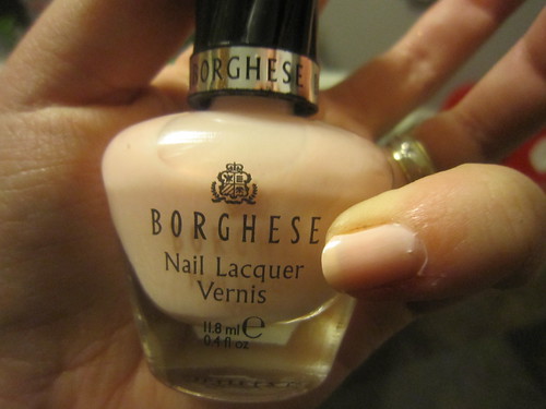
Comparison- Sheer opalescents
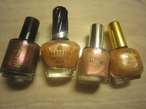
This is one of my favorite type of polishes. Shiny, shimmery, duochromatic, opalescent sheers. Above, from left to right, we have: Nina Ultra Pro "Molten Copper," Borghese "Patina Pearl," Pure Ice "Sea Shell," which is discontinued, and Sally Hansen "White Diamond," also discontinued.
The Pure Ice polish is my oldest actual bottle of polish. It was the originator of my "lazy mani" attitude of swiping on one coat of a sheer, opalescent polish and going on about my day. "Molten Copper" I bought back when I first got back into nails, this fall. Sally was having a buy 2 get 1 free for that brand I believe. The Borghese polish I found on sale recently at Walgreens, for $2.19 down from $8.17. I knew I already owned the similar Sally Hansen one, but I haven't been impressed with its quality, so I picked up the Borghese one to put them both through the gauntlet. I found the Sally Hansen one at my local Dollar Tree, along with other Sally Hansen polishes.
Now, when I swatched these, it was obvious that "Sea Shell" and "Molten Copper" looked nothing like the other too, so since my camera was getting full, I decided to just take pics of the Borghese and Sally Hansen polishes.
They were both pearly in general, with green on one side and pink on the other. They looked so similar, although the Borghese has a slightly stronger pink flash than the other. Ultimately, I liked the Borghese finish, and application, best. Poor Sally Hansen "White Diamond" now sits in my to-franken bag. It just takes way too long to dry and smudges like crazy. It is slightly more sheer and better for layering though, I'll give it that.
Saturday, January 8, 2011
nameless Wet n Wild, what are you?
One of the colors I thought my nameless Wet n Wild holiday gift-set pink might have been was Wild Card. Walgreens restocked their WNW display, so I snagged it. I knew when I saw the bottle in person that it was not my nameless color. I did a comparison anyway. Wild Card is more purple, while the nameless one is more pink and more duochrome with a somewhat metallic finish. I like both quite a bit, but Wild Card wins. It's just lovely.
Enjoy!
Bright Lights, Big Color- Anchors Away Giveaway
Man, this gal is a giveaway freak! She is so generous! Check out her Anchors Away giveaway!
http://brightlightsbigcolor.blogspot.com/2011/01/one-more-time.html
http://brightlightsbigcolor.blogspot.com/2011/01/one-more-time.html
Friday, January 7, 2011
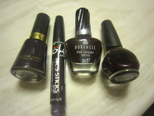
Comparison- Dark plums
I kinda have been obsessed with dark plums lately. Obviously, or I wouldn't have so many lol.
Pictured above, left to right: Revlon "Plum Night," Nic's Sticks "Dash Into the Dark," Borghese "Carnevale Grape," and Nicole by OPI "Show You Care." There are subtle difference to these colors. The Revlon is a dark vampy plum, almost black. The Nic's Stick is slightly grapier than the Revlon. The Borghese is opaque at one coat, and obviously red-toned and grapey, but at two coats, is nearly indistinguishable from the others. The NOPI color is similar to the others, an uber-dark, grapey-plum but it has lovely, delicate silvery shimmer which provides interesting depth.
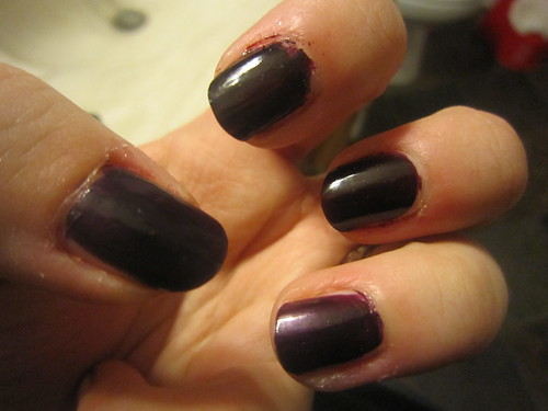
Quick n dirty swatch: thumb= Revlon "Plum Night," pointer= Nic's Sticks "Dash into the Dark," middle= Borghese "Carnevale Grape," and ring finger= NOPI "Show You Care."
The Revlon is a great example of a good, standard polish. I applies well in 2 coats, dries ok, nice and glossy, etc, and is easy and fairly inexpensive to find. The Nic's Stick, well...I don't like those things. I can't apply them very well. Lovely color, difficult applicator. The Borghese gets my vote for the fave of this spread. It's opaque with just one coat and dries at a decent rate and is nice and glossy with a lovely cushy, yet not smudgey, finish. It's also not so close to black as the others, so it stands out more. The NOPI one, that also is a fave, tied for first place I'd say. The shimmer just really sets it apart from the rest, and I think it's worth having, even if you have other dark plum shades.
Report card:
1st place: Borghese "Carnevale Grape & Nicole by OPI "Show You Care"
2nd place: Revlon "Plum Night"
3rd place: Nic's Stick "Dash into the Dark"
There ya have it!
Thursday, January 6, 2011
Comparison- Metallic Orange
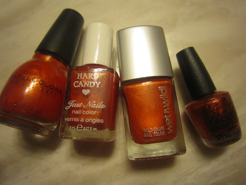
I ended up with oodles of metallic, shimmery, or glittery oranges after Christmas. Pictured above, left to right, is Sinful Colors "Courtney Orange," nameless Hard Candy from a Wal-Mart gift set, a nameless Wet n Wild, also from a holiday gift set (Dollar General), and then lastly OPI "Take the Stage."
I did a quick and dirty swatch:
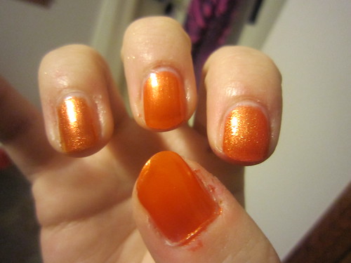
Thumb= SC
Pointer= HC
Middle= WNW
Ring= OPI
The Sinful Colors and WNW are almost identical. They have very similar quality as well, and are both pretty nice. The Hard Candy...whew boy. It's awful. Ain't worth a flying fart. Gritty, stinky, goopy, took forever to dry, ec etc. The fumes from the Hard Candy polishes was just God-awful. Something funky is going on with them. And Take the Stage is nice, but I just don't like glitters in general. It's difficult to apply. It dries nice though and was hardy.
If I had to pick a fave, it's definitely Sinful Colors. A close second is the nameless WNW. Third is OPI "Take the Stage" but only if you like that sort of finish. The Hard Candy one is worhless. It doesn't even earn "4th place" because that implies some sort of value. It's terrible. The bottle is ok though, if you empty it to franken with, but I'm finding it extremely difficult to get the glitter all out.
Wednesday, January 5, 2011
Borghese- Angelica Blush
Baby
You're my angel
Come and save me tonight
You're my angel
Come and make it all right
---Aerosmith "Angel"
This is a polish I picked up on clearance for 2.19 at Walgreens right after Christmas. My L.A. Colors Classic Pink for french manis turned out bupkis. It was streaky and sheer, so I slated it for frankening (it now has a new life as a yummy golden-pink champagne color, which I've dubbed Aurora and I'll feature soon, or dreckly as my granny says.)
So, I picked up this color, hoping it would fill that now-empty spot. It is a mixed review. On one hand, it was thickish and somewhat streaky- at first application. Luckily, it smoothed out and took on an even glossy, milky-pink tone at 2 applications. My advice is to do the first application thin, then a moderate coat for the second application, to have even coverage and a nice, cushy finish once dry.
Ultimately, this will suit my purposes well and I am no longer in search of a sheer pink for french manis.
Report card:
Color= C+ (this is 'bout as generic as it gets, but hey, classics are classics for a reason I guess)
Formula= B- (suitably average, but would be nice if it were quite so thick)
Brush= A+ (love Borghese brushes)
Price= F (these run $8+ a Wags. If you want to spend that, buy OPI or something else)
Overall= C+
Subscribe to:
Posts (Atom)